Nutrie
Brand design for a vitamin gummy company.
This brand is created with the goal to exude a premium, luxe feel, to inspire the belief that health and wellness are not only necessities, but also a form of self-care and self-pampering.
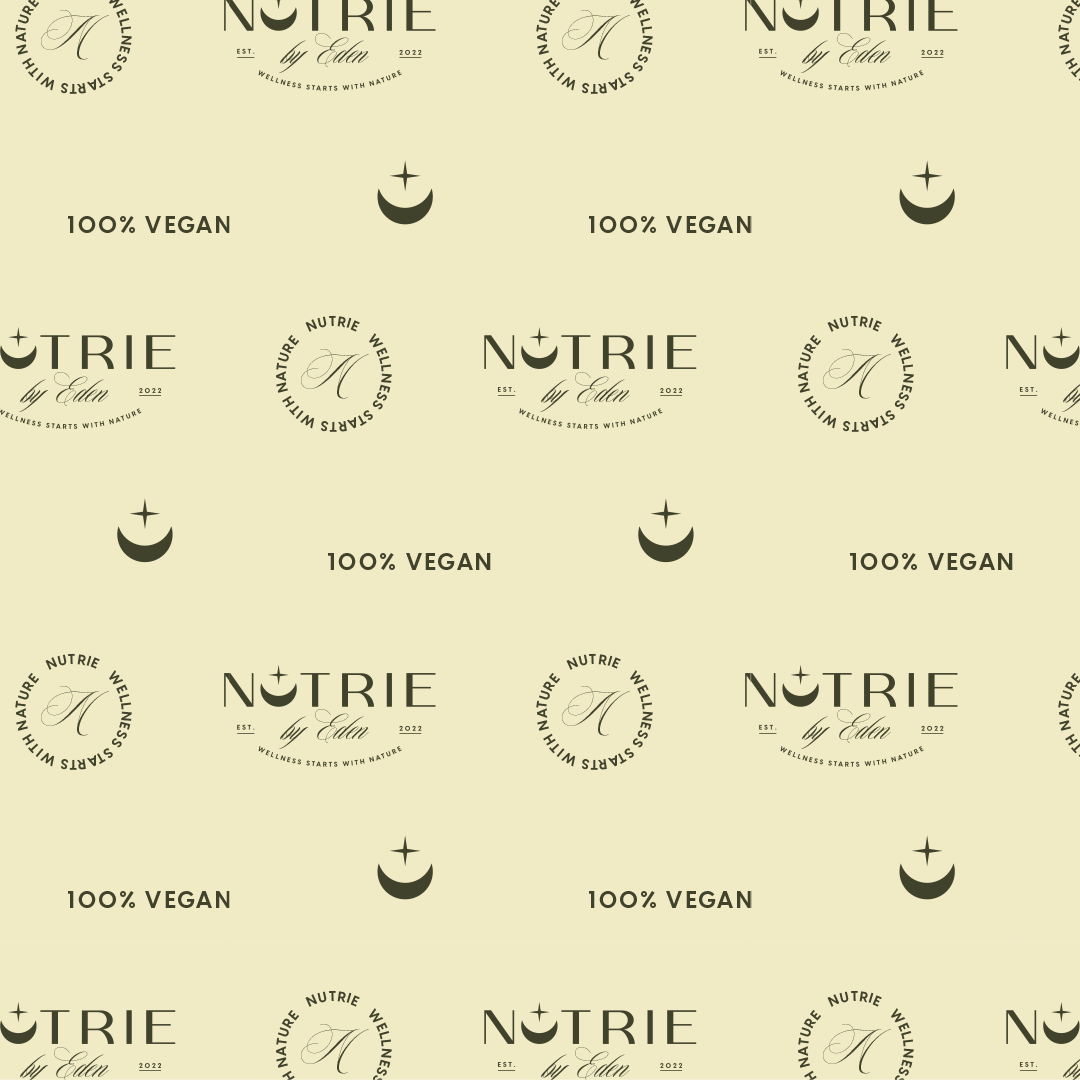
The brand icon features a moon and star, forming a direct link to the brand slogan, “wellness starts with nature”. It is important for the brand to communicate its commitment to nature and the development of natural products. The moon, a celestial body intertwined with human health and well-being, holds particular significance, especially for the brand’s core audience, which predominantly comprises women. With a conscious decision to sidestep the commonly employed earth-related motifs, the brand embraces a more novel approach to encapsulating the essence of nature. Choosing an outer space theme serves as a distinctive and inspired alternative.
The space-related theme extends to the color palette with a bright yellow. A dark, smoky green and a light, cool-toned green are chosen as well. This decision underscores the brand’s dedication to environmental responsibility and sustainability, even as a more innovative visual representation of nature is explored in the brand icon.


