Cuts By Caro
Brand design and social media templates for a hair stylist.
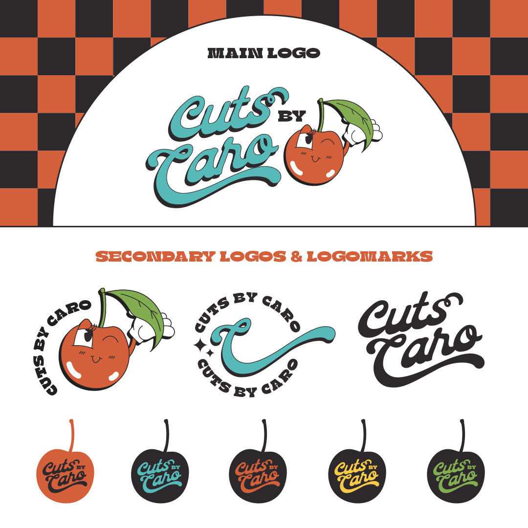
The brand was developed to capture a blend of retro/vintage nostalgia while maintaining a modern and refined sensibility, qualities that resonate particularly well with millennials and Generation Z.
Both chosen typefaces evoke distinctive graphic design trends of past decades. The expressive curls and flowing waves integrated into the words "Cuts" and "Caro" subtly represent the nature of hair.
The brand's mascot, designed in the rubberhose style reminiscent of the 1920’s, is a pivotal visual element. Depicting a personified cherry, this character playfully extends its hand toward the leaf dangling from its stem – a charming visual representation of someone happily adjusting their fresh, new haircut.
Social media templates incorporate playful shapes and graphical elements. These are strategically implemented to mirror the vibrant and easygoing personality of the brand owner.


